
Joy in the aisle

Post pandemic we’ve noticed several brands whose presence on the shelf is so bright, so noticeable, and so emotive that we’ve deemed them Packaged Joy. These products vary from protein powder to frozen entrees and how they show up at shelf, particularly in contrast to their category cousins, is electric, amplifying and happiness inducing. They’ve succeeded at packaging optimism and becoming a focal point for joy at shelf.
Moo Less Protein

This breakout star at shelf challenges all category norms and draws attention in the best way. Moo Less Protein, by Natreve, is “sustainable, animal-free whey protein powder” – packaged in a slip-cover box with individual packets inside. Compared to its shelfmates, the boxes loudly pop, gaining attention from twenty feet away for its differentiating form, and still delivers when up close and personal. Using an amoebic cow like pattern of pastel on pastel, its modern design and delivery system feels fresh in a space that concentrates on serious or pure promises.
VEE TEE RICE

Taking a similar box-in-a-non-box aisle approach, VEETEE Rice takes this staple up a notch. Easy to store, and the lid double duties as a measuring device, it brings a delightful presence to the shelf, plus it’s 100% recyclable. Veetee’s illustrations evoke a sense of place while the color still shines in the negative space that allows the design to breathe.
Kroger’s SO CHEESY crackers

The package exudes positivity and delight by featuring photobooth images of people holding the cheesy crackers. In an already loud and colorful aisle, it jumps off the shelf by engaging our natural inclination towards human faces.
Goodles

In a category that’s recently been filled with innovation and more fun, Goodles mac & cheese brings nostalgic, roller-skating style to the aisle. Goodles brings protein and pre-biotics to the space wrapped in a ton of fun. Clean package design, colors that jump right into the cart, and delightful naming all contribute to its play-to-win strategy.
Oliphant Brewing
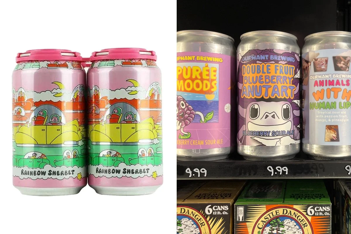
Packaged in Stillwater, MN – these delightful cans elicit curiosity and connection with the hand-drawn typography and off-kilter visuals. Funky adult beverage containers are not new in the liquor store, but this kind of underground quirk feels arresting next to more traditional depictions. In addition, the fun names ramp up our interest and make them an intriguing BYOB and conversation starter to the next party.
Helpful Hens
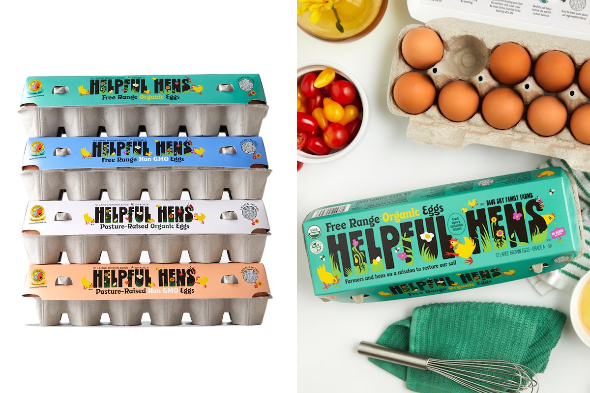
Who couldn’t help but love these bright, cheerful chickens and their eggs? Borne of regenerative farming practices, Helpful Hens hatches joy in the dairy case by using traditional recycled pressed cartons overlaid with a brightly illustrated recyclable label. In our era where decanting products to make a cheerful, organized fridge is in vogue, this packaging is a hard one to give up for all its sunshine and joy.
Wholly Veggie
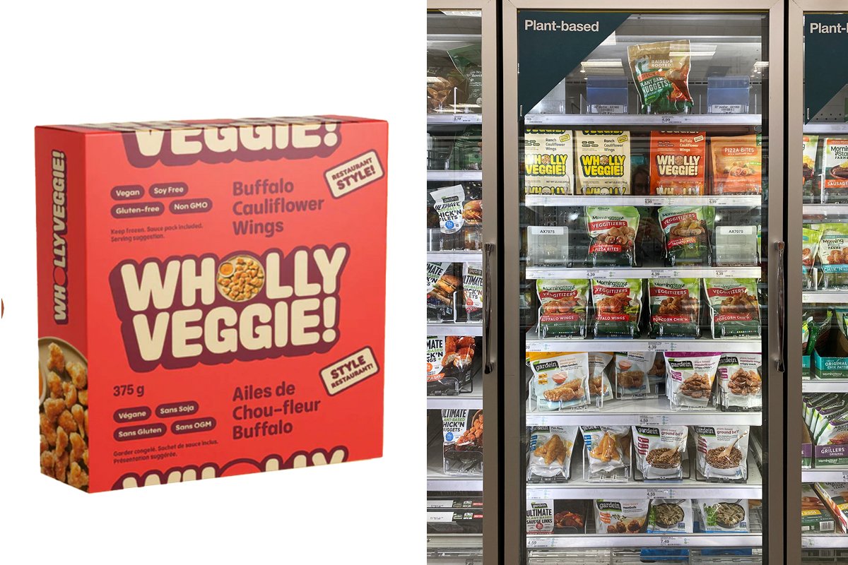
With plant-based meals and snacks on the rise, Wholly Veggie boldly claims its space in the freezer aisle - first with their clean, easy to read typography, and secondly with their bright packaging. The simplicity and design hierarchy of the package allow the brand to come first, followed by SKU (color) and then a small dash of food photography. This strategy almost reverses other brands’ strategies in the category, making it a stand out and it seems to shouts “we’re different and interesting” from 10 feet away or more.
Seed Ball Kit

These adorable Seed Ball Kits by Modsprout were spotted at Target and made us want to plant each one! The sweet, hand-drawn illustrations fit the unique package form well. The side panels showcase even more illustration and the back panel delivers clear, well organized planting instructions.
Pluckly Pickle Dip/Toom Hummus

In the chilled grocery case near the hummus, these bold, loud dips shouted at us from afar. Their bright palettes and clean packaging piqued our interest. Plucky Pickle Dip and Toom are both based in the Twin Cities and made the leap to retail. With vibrant packaging, in a sea of beige and white, they snap.
As we can see, regardless of category, these products found the “white space” in the aisle, case, or shelf and filled it with bright colors or used atypical forms to shift perception and draw attention. Where can your brand stand out like this? What levers could be modified to get more eyes and buys in store? Follow along for Part 2, where we discuss these packages with designers and define strategies for bringing more joy to the aisle.