
Discussion: Joy in the aisle

We wanted to continue the Joy in the Aisle conversation and further highlight the ways that these brands sought successful space on shelf, so we connected with a few Ultralites. We discussed methods that each example employed to bring both attention to themselves, and joy to consumer.
We found that claiming space where other brands were not leaning into was a clear way to grab gaze. Here are some of the spaces worth claiming if you’re wanting to create more joy.
Claim an attitude – (ex. Goodles) An attitude or brand behavior can include a logo, palettes naming and copy. It forces decisions in hierarchy based on the brand personality and less on consumer need state, often using a familiar set of visual cues and language. Attitudes may be polarizing but can help solidify super fans.
Claim an aesthetic – (ex. Oliphant Brewing, Vee Tee Rice) An aesthetic is a set of principles or guidelines that help craft a style or look for an entire look or collection, particularly fitting for multiple flavors or SKUs living in under one roof. Less driven by personality and more driven by style, it can set a brand apart from the crowd.
Claim a vibe – (ex. MooLess, SoCheesy, Wholly Veggie) A vibe evokes an emotional state created by the brand communicated through design and copy and hinges less on overt brand behavior and more on consumers’ feelings. Unexpected vibes can split an audience but can foster dedication from consumers.
Claim a form – (ex. MooLess, Seed Ball Kit, Vee Tee Rice) A form is the physical shape of the package or product. Unique or category breaking forms can attract attention and bring joy and become an ownable equity element for brands.
Claim a color/palette – (ex. Helpful Hens, MooLess, VeeTee Rice, Toom, Plucky Pickle) A color or palette are a hue or a collection of hues of a line of products. Palettes that think “outside of the box” in a category gain their share of eyeballs but might struggle to fit in with the expected and therefore go unseen by some consumers.
Here’s our conversation
ATTITUDE - Goodles

JESS: Super fun naming. When I went to their website, I thought “this translates really well” – digitally and socially and their iconography is fun. They were backing up the attitude.
KEVIN: You can actually get branded roller-skates on their website.
BEN: I love the color palettes – they seem so bold and appropriate for a younger generation who are looking for that breakthrough casualness. Like it’s not this polished perfect brand. It’s being bold for the sake of being bold.
POOM: I have to give them credit for not trying to be “healthy” color wise. The palette feels very not food related and they just go for it. It works well with the photography style, type choice – just all in.
KEVIN: I think it’s organic too which is not what you would expect from that palette.
JOELLEN: It’s 14g of protein in a serving which is significant in the mac & cheese space but that’s not what they’re leading with. They have their claims there but it’s not as loud as you would expect from a product launch.
AESTHETIC – Oliphant brewing
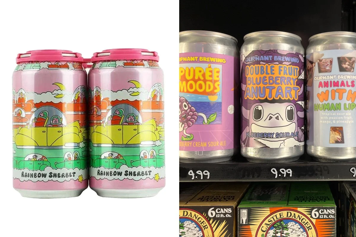
JESS: I was blown away with all the different types of illustrations and styles on their cans. That immediately pulls you in and makes you want to turn the package and see what it’s about. I liked the naivete of it, the illustrations remined me of middle school doodling with the wonky kind of bubble type that you hand draw. Innocent and sweet. Quirky.
JOELLEN: Some of the SKUs feel like they’re still frames of TikToks with GIFs or digital stickers, filters, or memes. I think there’s a sense of humor but you’re right Jess, there’s an underground or off-kilter element.
BEN: There’s not much unifying these packages, but they hang together, which is cool.
KEVIN: I feel like you can get away with not being so singularly branded when there are beers, specifically like these ones, where it’s really about what it’s made from and the taste of it. Verses like, Miller Lite, because people are super brand loyal on stuff like that. For me, I don’t search for who’s making it, when it’s really about what it is.
JOELLEN: When you’re just making something for THIS summer, and you don’t need to follow consistency, you can run with it. For smaller runs the priority is showing up and being interesting.
VIBE - MooLess Protein

JOELLEN: MooLess seemed so happy compared to whatever’s going on here in the section – like, this could be something that is a happy part of someone’s life.
BEN: In this aisle there’s such a convention of white or black to connote that it’s clean and it’s efficient and peak body performance thing and this just subverts that so well by leaning into color and happiness. It’s about the joy, not just the functional benefits.
POOM: I really like the copy too, it drew my eye in and I read a little more. Short and sweet, to the point.
VIBE - Kroger’s So Cheesy

BEN: Poom used the word gimmick and I think that’s kind of what’s working. They leaned into the gimmicky cheesiness. They called it So Cheesy. It’s very unapologetically family friendly and goofy”
VIBE - Wholly Veggie
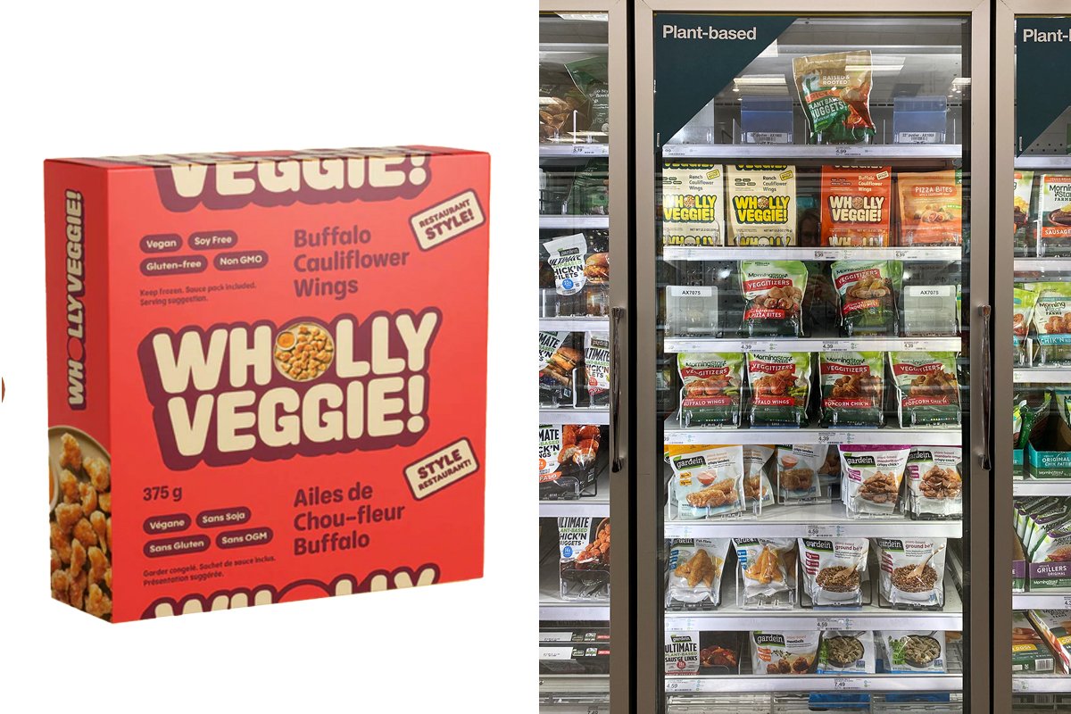
JESS: Even though it’s really stripped down, it still has a vibe or personality. It doesn’t come off as completely just informative.
JOELLEN: The little food photography that’s there has that 80’s style with the harsh lighting. Vintage feeling. The Wholly Veggie name feels like it’s from a Batman comment – or pop culture, it’s not so serious and same, same, same as the other packages.
KEVIN: It is interesting how small the food is on the front. But as someone who has bought a lot of the stuff and tried it you can never really trust the image on the front. I feel like if you’re someone who shops this aisle, you’re okay with the food being a little laid back and you’re going to try it just based on, “Oh it’s new, it looks cool.” You’re not trying to make it look like the other packages there, with the green and these amazing home cooked meals. You can be a little more joyful with your package, you can have more fun with the packaging, which is cool.
BEN: They leaned into the name and felt it was communicating enough and they just went, “Yeah, that’s enough.”
KEVIN: Aside from the color palette, just name with the exclamation point, which you don’t really see that often, changes it in a fun way.
FORM - MooLess Protein
JESS: The form immediately for me is like, oh it’s not gonna be as messy. When I pour powders from big jar or use a scooper, you’re putting your hand in there – so it makes me curious.”
FORM - Seed Ball Kit

POOM: The form, I gravitated to it. The shape and all the sides, it’s very different.
KEVIN: I think the concept just adds to the joy, knowing you could pick up this little thing (motions to pick it up) and it would give you a certain outcome rather than just grabbing all the random packets.
JOELLEN: I like the way the illustrations fit the form, they’re not divided on the panels but they work with it.
COLOR – HELPFUL HENS
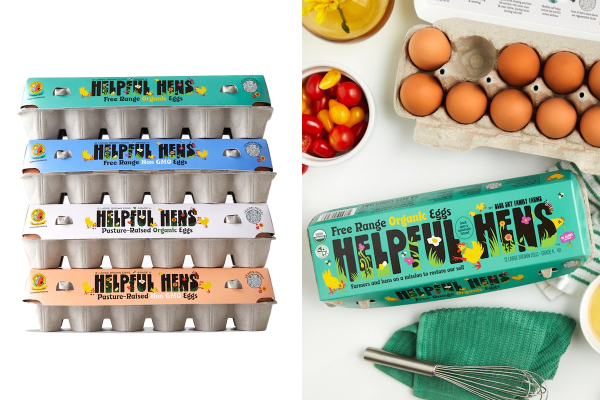
POOM: The color drew me in because that aisle is white, cardboard. I gravitated to the illustration – it’s a positive illustration style. It made me want to know more. On Instagram all this illustration comes to life. They’ve animated it cute with the little chick.
JESS: Seeing them stacked on the side and using the negative space with that rainbow of colors in that aisle is very refreshing against the natural tones of the cardboard.
BEN: Teal is back, baby!
KEVIN: I’ve been seeing it everywhere - even on that Goodles package. It doesn’t seem like a food color, because it’s artificial but it’s interesting when it’s used on something like this for a thing that’s extremely un-artificial.
JOELLEN: We’ve been seeing these pops of color in the organic space for a few years. Do you think it’s coming from the audience like, “Yeah yeah, we expect it to be organic but it doesn’t have to be boring?”
BEN: We’ve seen bright colors in the non-organic space, and the organic space originally latched onto these (soft) colors as a way to differentiate. But now that natural/organic space has grown so much they need more differentiation among them.
JOELLEN: Or maybe it’s to say that they are a modern organic brand? Years ago, when we were designing stuff to go into Whole Foods, we were told it had to have that kraft paper background or they (customers) won’t believe that it belongs - but that’s not true anymore.
KEVIN: The market is more saturated now and you have to stand out more. Maybe it’s not about your product but how you’re presenting it in this space.
POOM: So be unique and have your own personality – it’s obviously working here.
—-
For many, joy can be so hard to come by, especially in a continuing pandemic and challenging time. Our conversation shows that brands still have a big opportunity to connect with consumers by finding the right strategy to play within their category, whether through attitude, aesthetic, vibe, form, or color, and create a little joy in the aisle.
Featuring:
Ben Alpert
Kevin Fluegel
Poom Seitz
Jessica Ward Hill
JoEllen Martinson Davis